Data Analysis

Load the packages

library(tidyverse)
── Attaching core tidyverse packages ──────────────────────── tidyverse 2.0.0 ──
✔ dplyr     1.1.4     ✔ readr     2.1.5
✔ forcats   1.0.0     ✔ stringr   1.5.1
✔ ggplot2   4.0.0     ✔ tibble    3.3.0
✔ lubridate 1.9.4     ✔ tidyr     1.3.1
✔ purrr     1.1.0     
── Conflicts ────────────────────────────────────────── tidyverse_conflicts() ──
✖ dplyr::filter() masks stats::filter()
✖ dplyr::lag()    masks stats::lag()
ℹ Use the conflicted package (<http://conflicted.r-lib.org/>) to force all conflicts to become errors
library(rnaturalearth)
library(viridis)
Loading required package: viridisLite
library(maps)

Attaching package: 'maps'
The following object is masked from 'package:viridis':

    unemp
The following object is masked from 'package:purrr':

    map

Load data

load("data/carbon_cleaned.RData")
load("data/gni_cleaned.RData")

Question 1 Analysis

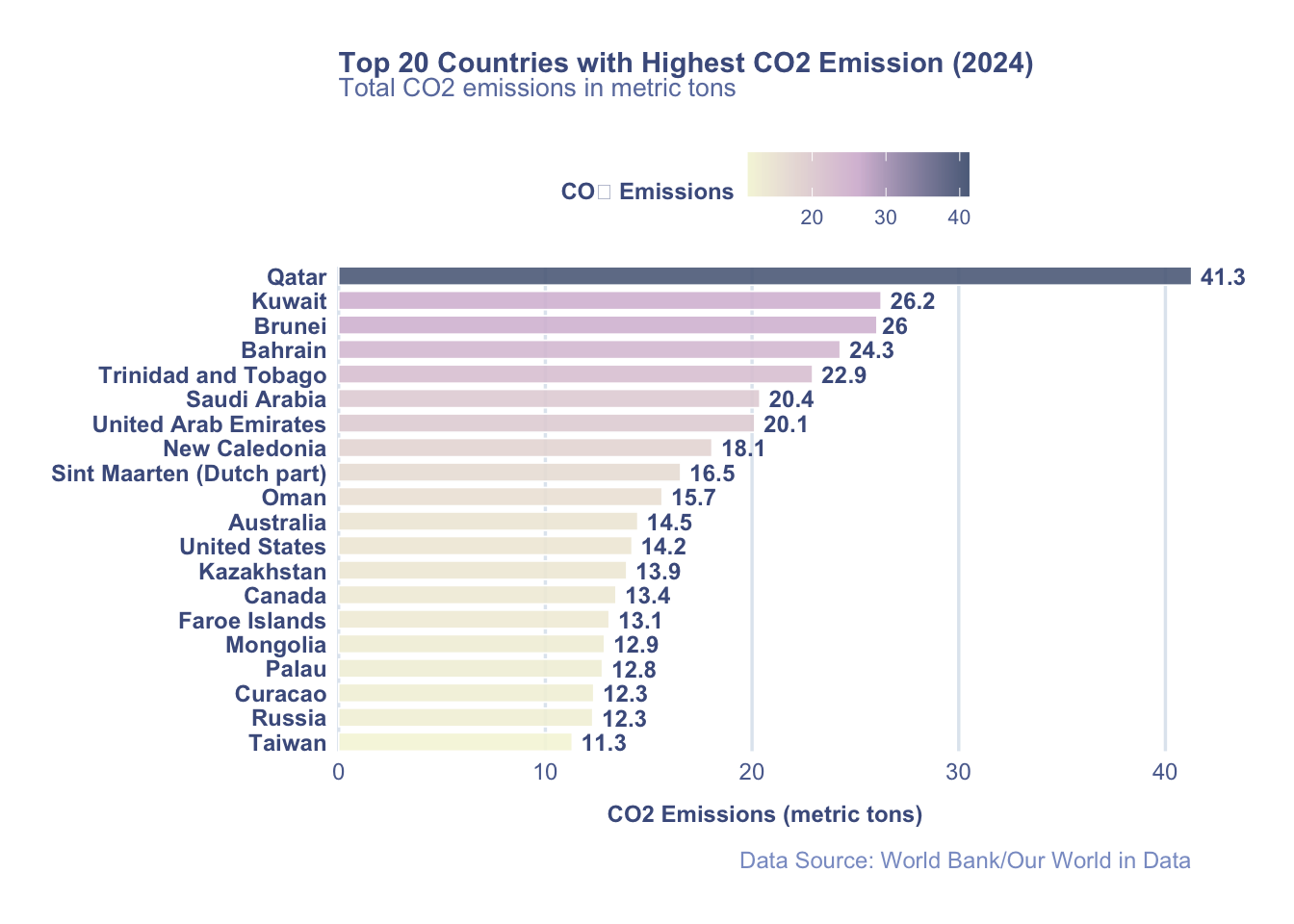
What are the Top20 countries with the greatest CO₂ emissions per capita in the most recent year?

# identify the most recent year
carbon_cleaned |> 
  summarise(recent_year = max(year))
# A tibble: 1 × 1
  recent_year
        <int>
1        2024
# list Top20 countries with the greatest CO2 emissions per capita in 2024
top20_2024 <- carbon_cleaned |> 
  filter(year == 2024) |> 
  arrange(desc(emissions)) |> 
  head(20)

Question 1 Visualization

ggplot(top20_2024, aes(x = reorder(country, emissions), 
                       y = emissions,
                       fill = emissions)) +
  geom_col(width = 0.75, color = "white", linewidth = 0.3, alpha = 0.9) +
  scale_fill_gradientn(
  colors = c("#f5f5dc", "#d8bfd8","#5d6d8a"),
  guide = guide_colorbar(title = "CO₂ Emissions")
) +
  
# add labels
  geom_text(aes(label = round(emissions, 1)),
            hjust = -0.2, 
            size = 3.2,
            fontface = "bold",
            color = "#4a5c8c") +
  
  coord_flip(clip = "off", expand = FALSE) +
  
# add bar chart names and labels
  labs(
    title = "Top 20 Countries with Highest CO2 Emission (2024)",
    subtitle = "Total CO2 emissions in metric tons",
    x = NULL,
    y = "CO2 Emissions (metric tons)",
    caption = "Data Source: World Bank/Our World in Data"
  ) +
  
  theme_minimal(base_size = 10) +
  theme(
    plot.title = element_text(
      size = 11,
      face = "bold",
      color = "#4a5c8c",
      margin = margin(b = )
    ),
    plot.subtitle = element_text(
      size = 10,
      color = "#6a7cac",
      margin = margin(b = 15)
    ),
    plot.caption = element_text(
      color = "#8a9ccc",
      size = 9,
      hjust = 1,
      margin = margin(t = 10)
    ),
    axis.text.y = element_text(
      size = 9,
      face = "bold",
      color = "#4a5c8c"
    ),
    axis.text.x = element_text(
      size = 9,
      color = "#5a6c9c"
    ),
    axis.title.x = element_text(
      size = 9,
      face = "bold",
      color = "#4a5c8c",
      margin = margin(t = 8)
    ),
    legend.position = "top",
    legend.title = element_text(size = 9, face = "bold", color = "#4a5c8c"),
    legend.text = element_text(size = 8, color = "#5a6c9c"),
    
  # grid line
    panel.grid.major.y = element_blank(),
    panel.grid.major.x = element_line(color = "#e0e8f0", linewidth = 0.6),
    panel.grid.minor.x = element_blank(),
    
  # background color
    plot.background = element_rect(fill = "white", color = NA),
    panel.background = element_rect(fill = "white", color = NA),
    
  # margin
    plot.margin = margin(20, 40, 20, 20)
  )

  # save the bar chart into png
    ggsave("out/top20.png")
Saving 7 x 5 in image

Question 2 Analysis

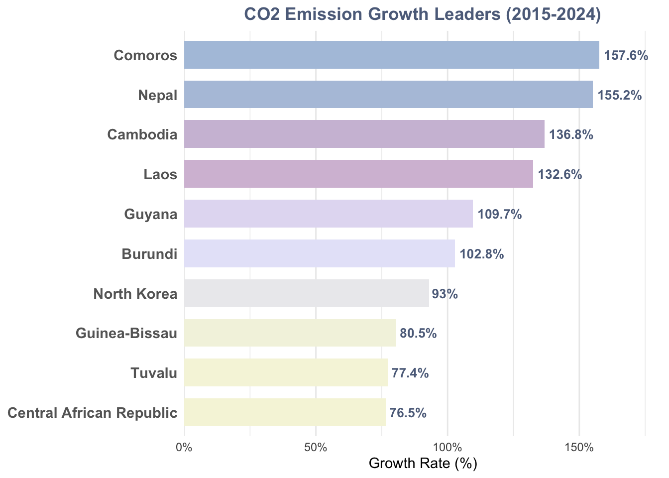
Since the baseline year of the Paris Agreement (2015), which countries have experienced the most significant growth rate in their per capita CO₂ emissions?

# obtain the data from 2015 and 2024
carbon_2015 <- carbon_cleaned |> 
  filter(year == 2015) |> 
  select(country, emission_2015 = emissions)
carbon_2024 <- carbon_cleaned |> 
  filter(year == 2024) |> 
  select(country, emission_2024 = emissions)
# merge 2015 and 2024 data
paris_analysis <- carbon_2015 |> 
  inner_join(carbon_2024, by = "country") |> 
  mutate(
    emission_increase = emission_2024 - emission_2015,
    growth_rate = (emission_2024 - emission_2015) / emission_2015 * 100
  ) |> 
  arrange(desc(growth_rate))
# check for outliers in the data
paris_analysis_cleaned <- paris_analysis |> 
  filter(
    emission_2015 > 0,
    !is.na(growth_rate))
# list top10 with highest growth rate country
top10_growth_rate <- head(paris_analysis_cleaned, 10)

Question 2 Visualization

ggplot(top10_growth_rate, 
       aes(x = reorder(country, growth_rate), 
           y = growth_rate,
           fill = growth_rate)) +
  geom_col(width = 0.7) +
  coord_flip() +
  geom_text(aes(label = paste0(round(growth_rate, 1), "%")),
            hjust = -0.1,
            size = 3.5,
            fontface = "bold",
            color = "#5d6d8a") +
# change the gradient color
  scale_fill_gradientn(
    colors = c("#f5f5dc","#e6e6fa","#d8bfd8", "#b0c4de"),
    guide = "none"
  ) +
  scale_y_continuous(
    expand = expansion(mult = c(0, 0.15)),
    labels = function(x) paste0(x, "%")
  ) +
  labs(
    title = "CO2 Emission Growth Leaders (2015-2024)",
    x = NULL,
    y = "Growth Rate (%)"
  ) +
  theme_minimal() +
  theme(
    axis.text.y = element_text(size = 11, face = "bold", color = "#666"),
    plot.title = element_text(face = "bold", hjust = 0.5, color = "#5d6d8a"),
    panel.grid.major.y = element_blank()
  )

# save the growth lead chart into png
ggsave("out/growth_lead.png", width = 8, height = 6)

Question 3 Analysis

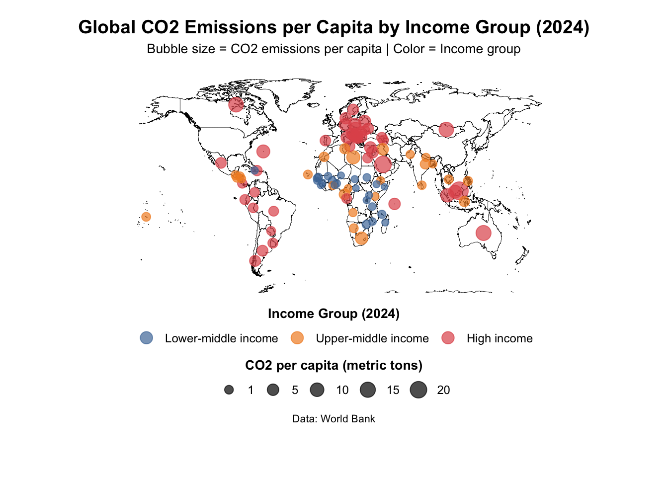
What is the global geographic pattern of per capita CO₂ emissions in 2024, and how does it visually correlate with national income levels on a world map?

# extract 2024 gni data and join with carbon_2024 data
gni_2024 <- gni_cleaned |> 
  filter(year == 2024) |> 
  select(country, gni)

# merge carbon and gni 2024 data
analysis_data <- carbon_2024 |> 
  inner_join(gni_2024, by = "country") |> 
  filter(!is.na(emission_2024),
         !is.na(gni),
         gni > 0) # check for outliers in the data
# create income groups based on 2024 World Bank GNI per capita classification
analysis_data <- analysis_data |> 
  mutate(
    income_group = case_when(
      gni <= 1135 ~ "Low income",
      gni >= 1136 & gni <= 4495 ~ "Lower-middle income",
      gni >= 4496 & gni <= 13935 ~ "Upper-middle income",
      gni >= 13936 ~ "High income",
      TRUE ~ NA_character_
    ),
# list them in correct order
    income_group = factor(
      income_group,
      levels = c("Low income", "Lower-middle income", 
                 "Upper-middle income", "High income")
    )
  )
# check income classification summary
income_summary_2024 <- analysis_data %>%
  group_by(income_group) %>%
  summarise(
    n_countries = n(),
    avg_gni = mean(gni, na.rm = TRUE),
    avg_co2 = mean(emission_2024, na.rm = TRUE),
    median_co2 = median(emission_2024, na.rm = TRUE),
    .groups = 'drop'
  )

Question 3 Visualization

# create world map data
world_map <- map_data("world")

# standardized country names
plot_data <- analysis_data |> 
  mutate(region = case_when(
    country == "Bosnia & Herzegovina" ~ "Bosnia and Herzegovina",
    country == "Brunei Darussalam" ~ "Brunei",
    country == "Myanmar" ~ "Burma",
    country == "Ivory Coast" ~ "Cote d'Ivoire",
    TRUE ~ country
  )) |> 
  
# order income group
  mutate(
    income_group = factor(income_group,
      levels = c("Lower-middle income",
                 "Upper-middle income",
                 "High income"))
  ) |> 
  
# calculate each countries' location
  left_join(
    world_map %>%
      group_by(region) %>%
      summarise(
        long = mean(long, na.rm = TRUE),
        lat = mean(lat, na.rm = TRUE),
        .groups = 'drop'
      ),
    by = "region"
  ) |> 
  filter(!is.na(long))

# arrange three colors for different income groups
three_income_colors <- c(
  "Lower-middle income" = "#4E79A7",  # 深蓝色
  "Upper-middle income" = "#F28E2B",  # 橙色
  "High income" = "#E15759"          # 红色
)

# visualized by using a world map
p1 <- ggplot() +
  geom_polygon(data = world_map,
    aes(x = long, y = lat, group = group),
    fill = "white", color = "black", linewidth = 0.15) +
  
# bubble world map
  geom_point(data = plot_data,
    aes(x = long, y = lat,
        size = emission_2024,
        color = income_group),
    alpha = 0.7) +
  
# adjust bubble ratio
  scale_size_continuous(
    name = "CO2 per capita (metric tons)",
    range = c(2, 6),
    breaks = c(1, 5, 10, 15, 20),
    guide = guide_legend(
      title.position = "top",
      title.hjust = 0.5,
      direction = "horizontal",
      nrow = 1
    )
  ) +
  
  scale_color_manual(
    name = "Income Group (2024)",
    values = three_income_colors,
    guide = guide_legend(
      title.position = "top",
      title.hjust = 0.5,
      direction = "horizontal",
      nrow = 1,
      override.aes = list(size = 4)
    )
  ) +
  
# fixed ratio
  coord_fixed(
    ratio = 1.3,
    xlim = c(-180, 180),
    ylim = c(-60, 85)
  ) +
  
# add labels
  labs(
    title = "Global CO2 Emissions per Capita by Income Group (2024)",
    subtitle = "Bubble size = CO2 emissions per capita | Color = Income group",
    caption = "Data: World Bank"
  ) +
  
# theme setting
  theme_void() +
  theme(
    plot.title = element_text(
      hjust = 0.5, 
      face = "bold", 
      size = 14,
      margin = margin(b = 5, t = 5)
    ),
    plot.subtitle = element_text(
      hjust = 0.5, 
      size = 10,
      margin = margin(b = 8)
    ),
    plot.caption = element_text(
      hjust = 0.5,
      size = 8,
      margin = margin(t = 5)
    ),
    
  # legend position at bottom
    legend.position = "bottom",
    legend.box = "vertical",
    legend.box.just = "center",
    legend.direction = "horizontal",
    
  # legend margin
    legend.box.margin = margin(5, 0, 5, 0),
    legend.spacing.x = unit(20, "pt"),
    
  # legend text
    legend.title = element_text(size = 10, face = "bold"),
    legend.text = element_text(size = 9),
    
  # margin
    plot.margin = margin(10, 10, 40, 10)
  )

print(p1)
# save the map into png
ggsave("out/map.png")
Saving 7 x 5 in image