
About This Website
This is the project website of Vicky’s academic work at JMSC, under Prof. Bin Chen’s guidance.
About Me
Vicky is currently a postgraduate student at HKU’s Journalism and Media Studies Centre (JMSC), pursuing a Master of Journalism.
With a background in strategic communication and a growing expertise in storytelling, she is passionate about covering sports⚽️🏄🏻♀️🏸🚴🏻♀️🏀🏂 environmental issues♻️🌎📰, and social affairs. Her goal is to produce journalism that not only informs but also inspires meaningful public conversation and action.
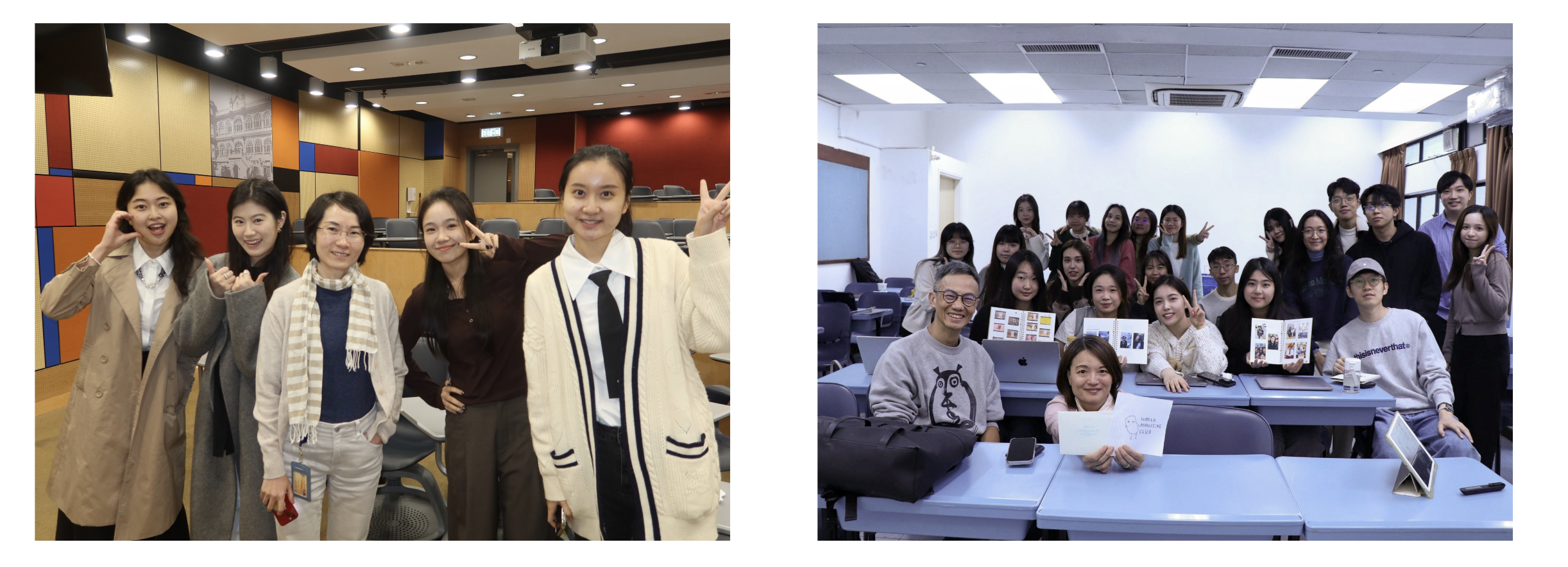
Education
The Chinese University of Hong Kong | 2021‑2025
Bachelor of Social Science in Journalism & Communication
Concentration: Advertising & Public Relations
The University of Hong Kong | 2025‑2026
Master of Journalism
Journalism & Media Studies Centre (JMSC)
Experience
Reporter & Social Media Intern | earth.org
Contributed to environmental journalism through news reporting, content creation, and social media engagement.
Producer Intern | iQIYI
Assisted in video production, content planning, and casting for iQIYI variety show
IMC Campaign Lead – L’Occitane Asia‑Pacific | Sustainability‑Focused Campaign
Developed and executed an integrated marketing campaign promoting sustainable practices across APAC markets.
Social Media Campaign Creator – Asiana Airlines | ‘Graduation Season’ Campaign
Designed and launched a creative social media campaign targeting graduates, enhancing brand engagement and visibility.
Contact Me
Email: vickyzhang@connect.hku.hk
AI Disclaimer
* The process of data cleaning and data analysis are all done by myself. AI assistance was used mainly for visualizing the results, as described in the following section:
| AI Tool used | The purpose of the assignment where AI was used | Your original work | Exact prompts and AI responses |
|---|---|---|---|
| DeepSeek | Visualization: 1) provide color scheme suggestions for three charts (two bar charts and one world map) | ggplot (top10_2024, aes(x = reorder(country, emissions), y = emissions)) + geom_col() + labs(title = “Top 10 Countries Emit the Most CO2 Emissions in 2024”, x = “Country”, y = “CO2 Emissions total per capita”) |
It creates a morandi color series: scale_fill_gradient ( colors = c(“#f5f5dc”,“#e6e6fa”,“#d8bfd8”, “#b0c4de”), library(viridis) ggplot(…) + |
| DeepSeek | Visualization: 2) help me solve the problems of overlapping and layout of chart elements | “The legend is displayed in the middle of the map, blocking many countries. How to adjust the layout?” | scale_size_continuous(guide = guide_legend(position = “right”, order = 1)) scale_color_manual(guide = guide_legend(position = “right”, order = 2)) |